The File Tree of Life
-
Development, Marketing Automation, Marketing Operations, Productivity
Published: January 12, 2024
Covering the platform, tech, assets and various libraries used that help create the site. A little bit of the thought process behind the design and development.
Jump to:
The Tech Used
About The Tech
The Why
A Quick Look
This website is built on the WordPress CMS
Using the Bootstrap framework
Custom Fonts are provided by Google Fonts
The main CSS animation library is Animate.css.
The Icons used are a mix of those provided by
FontAwesome, and Google Materials.
Most photographs are provided via Unsplash.
Other animations are credited to the users in the style.css file.
All logos and brand icons are trademarks of their respective owners.
The use of these trademarks does not indicate endorsement of the trademark holder.
WordPress is a popular open-source content management system (CMS) that powers a significant portion of websites on the internet. Known for its user-friendly interface and extensive plugin ecosystem, WordPress allows users to easily create and manage websites without extensive coding knowledge (and it's even better for those who do have that knowledge!). Its flexibility, scalability, and active community make it a go-to choice for bloggers, businesses, and developers alike.
Initially, I considered using WordPress, Ghost, Grav, or Drupal to build the site–all of these are excellent platforms. I chose WordPress because the majority of my client work (as it relates to these types of websites) is done on WordPress. I would've used Ghost if I planned to do more blogging or Drupal if I needed to build a far more complex website.
Bootstrap is an open-source front-end framework developed by Twitter, providing a comprehensive set of tools for building responsive and visually appealing websites and web applications. Widely adopted for its simplicity and flexibility, Bootstrap has become a staple in the web development community, streamlining the creation of modern, responsive, and mobile-friendly user interfaces.
You'll find a wide range of opinions when it comes to using a framework like Bootstrap. Others certainly do exist–Foundation, Bulma, Materialize, Tailwind CSS (love tailwind), Semantic UI–and they are, for the most part, all really good options. Simply put: I've always found Bootstrap to be the most well-adopted. Any of them are easy to customize (design sense and customization are key for any good website–you want to avoid your site looking like it is obviously based on any framework on the front end). Bootstrap allows for rapid development, responsive design, good cross-browser compatibility, extensive documentation, a large community and ecosystem, and consistency in its design.
Google Fonts is a free, extensive library of web fonts curated by Google, offering a diverse collection of typefaces for online use. Web developers and designers can easily integrate these fonts into their projects by linking to the Google Fonts API, enhancing the visual appeal and readability of websites. With a vast selection of fonts that can be accessed and utilized without cost, Google Fonts has become a popular resource for improving the typography of digital content.
Using only default web-safe fonts is boring. Using custom fonts is the new web standard and Google Fonts is one of the easiest ways to get them on your website. I like using a minimal number of fonts on any project, but enough to provide good contrast and visual interest.
Animate.css is a popular open-source CSS library that simplifies the process of adding engaging animations to HTML elements. With a wide variety of pre-built animation classes, developers can effortlessly integrate entrance, exit, and attention-grabbing effects into their web projects. This lightweight and easy-to-use library enhances the visual appeal of websites by bringing elements to life with smooth and visually pleasing transitions.
I write a lot of custom CSS animations and writing a default set of animations usually doesn't interest me. Having a default set of tools at your fingertips is useful. For me, when it comes to CSS animations, Animate.css is that toolset.
Font Awesome is a widely used icon toolkit and font designed for web development, providing a vast collection of scalable vector icons. These icons can be easily customized using CSS, allowing developers to add visually appealing and consistent icons to their websites or applications. With a diverse range of icons covering various categories, Font Awesome streamlines the process of integrating high-quality, scalable icons into projects without the need for extensive image assets.
Just like Animate.CSS, I don't want to take the time to create icons when proto-typing a website. Font Awesome is a great foundation for getting iconography on your website. And the same goes for Google Materials (just with a slightly different visual flair). If you're a big brand, however, you need to go the extra step and create your own unique iconography.
Unsplash is a popular online platform that offers a vast collection of high-resolution, royalty-free images contributed by photographers worldwide. Renowned for its stunning visuals and user-friendly interface, Unsplash provides a valuable resource for creatives, designers, and developers seeking high-quality imagery for various projects. The platform allows users to download and use the images for free, making it a go-to source for visually appealing content across a wide range of applications.
It's free. Trying to find good royalty-free photos is a pain in the ass. Unsplash makes it easy. There are other/similar platforms, but Unsplash is the best one. That said: nothing will ever replace taking your own unique photos! Support creatives.
I started getting enough requests for examples of work and making a website made the most sense to satisfy those requests. This site itself both serves as a reference, as well as a good place to house a portfolio.
...Also, I had the time and wanted to do something fun.
(Like put in that blockquote)
I thought it would be fun to take a quick look at the homepage and write a little about some of the thoughts I had that went into creating the different sections on the page.
Sorry if you're looking at this on a mobile device, but I'm only going over the desktop experience for now.

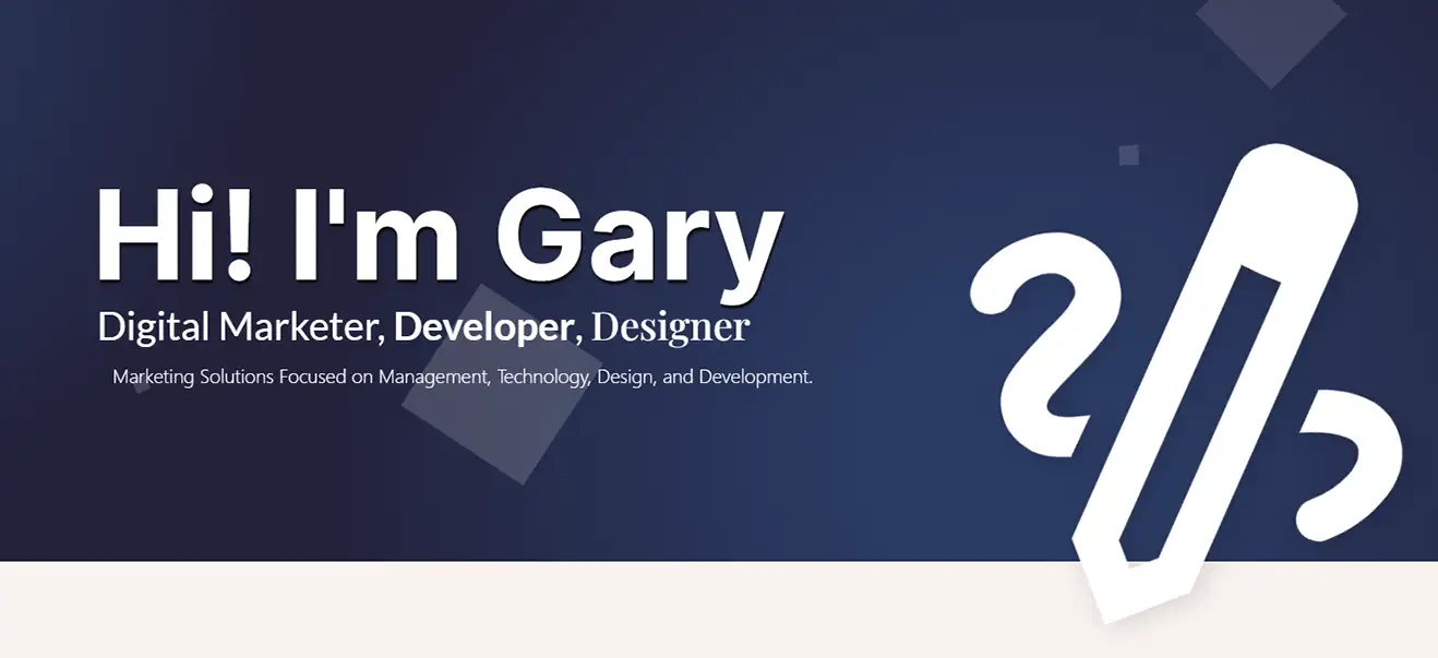
Hey, ya know, I like blue! It is my favorite color and has always been one of my go-to colors when I'm putting together a design (even if just as a placeholder). I've found it's probably the best neutral corporate color (right up there with black and white). I wanted the site to be simple and beautiful. So, the first impression of the site must convey that feeling.
If I were working on a website meant to function more similarly to an independent agency (or a small business), I might've considered putting my email and phone number in small text, and possibly in a bar above the main navigation. Normally, you want to make it as easy as possible to get a hold of you–but, frankly, I get enough SPAM phone calls. I'm also not likely to make the navigation sticky/affixed unless there's a compelling reason to do so (and here there isn't).
The main logo is white so it stands out a bit more, whereas everything else is off-white so it fades into the background a little bit. Note: this also makes for an easy CSS on-hover scheme when using the navigation (i.e., just make it transition to white). The icon is the Google Material one for 'drawing'–and that is pretty 'on the nose' for me. It feels simultaneously regal and creative.
Use varying contrast to help provide relief from eye strain as well as guide the user gaze, as they browse your website.
I placed a few Easter Eggs on the site for the eagle-eyed viewer to find.
The first is that the tagline randomly changes on page load.
I'm not a fan of every website being 'flat', 'static', or without movement. Of course, some websites can't handle animations effectively–and that's OK (think: news websites, for example). For my site, I wanted some kind of animation behind the header. Video didn't seem appropriate (I don't have any that seems it would work, and I also don't want to pay for any unless I had a very clear vision), but I already had some ideas for some neat things I could do with CSS animations.
This floating 'squares' animation is meant to mimic bubbles–it's a modified version of a circles animation I had found (see CSS file for credit). But for the first/default animation, I thought circles were a little too much like... a fish tank? (I later found one I liked and worked it in as an alternate background, though). Rotating squares felt kind of techy, so I went with that.
The tagline is one of the very few places I use the 'Inter' font, which–like 'Plafair' (the serif font I use) and 'Lato' (the sans serif font I used)–is a fantastic font.
The indent on the 3rd line of text coupled with the direction the pencil points (as it's just a larger version of the 'draw' icon again!) funnels the user’s vision downward, to help keep the eye moving down the page. The 'big icon' crosses the border between two areas with a slight drop shadow, giving a subtle illusion of depth–something that can be difficult to achieve and use effectively.
Use big fonts and padding to express confidence and provide focus. Dense content needs to be supported by the importance of what's provided.
Psst! Click the pencil. Each of the 'big icons' has a hidden interaction that changes the animated background to an alternate version!
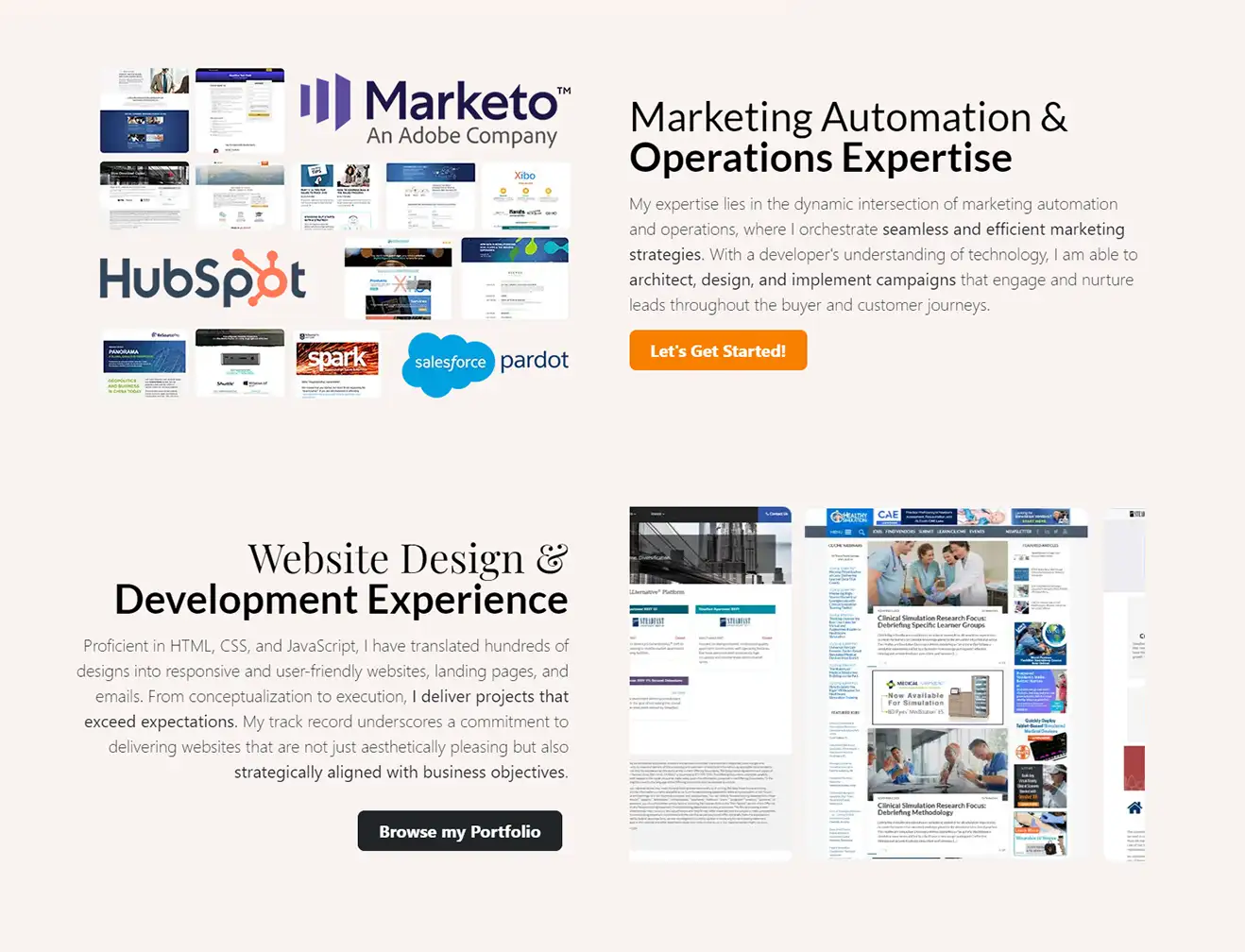
So, initially, I had the site going straight into my Services & Skills section (aka, just a slightly remixed version of my resume), but I looked at it and said to myself, "Self, absolutely no one will want to hire you for marketing if they see that. You need to at least make an effort at selling yourself first." Hence, the genesis of these two blocks.
I knew early on that I would want some logos high up and it seemed appropriate to focus on the platforms where I do the majority of my work (Marketo, Pardot, and Hubspot). And then in the second block, I knew I'd want to vary the graphical presentation a bit and I've always loved the CSS-only(!) sliding scroller.
Using logos can help create user trust. Whenever you can appropriately use a good logo, you should–just don't overuse them.
I refuse these same blocks in a similar fashion on my portfolio. When you can reuse design language it helps provide visual cohesion on your site.
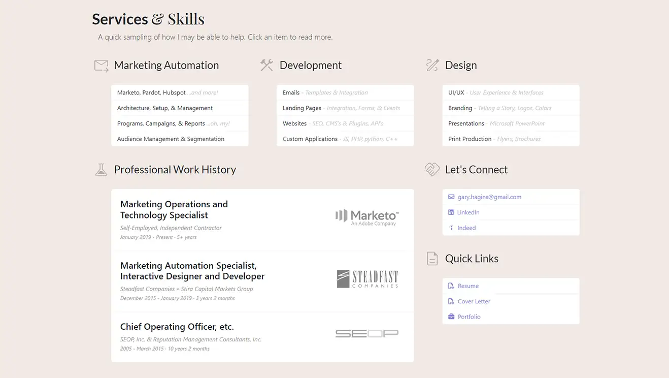
Yes, I know, this area of the homepage kind of sucks (...for now). I plan on reworking it eventually–e.g., I will likely add my certifications above this area and link various specialties in the bullets to blog posts (once they are written) or tags/categories (once they have a sufficient number of blog posts behind them). I might also change the list formatting to be a standard text/flat area for the first three blocks and then have a varied number of bullets. I just have to make sure it will all work visually. For now, I am OK with presenting the 'resume light' version shown here. After the first draft, I added pop-ups for each of the items. But, that's also another thing I am already considering re-doing.
There's a faint bracket when you mouse over this section (on the left side). It's very light, so it blends into the background.
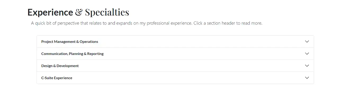
These content blocks could just as easily be blog posts... and perhaps someday I will work the content inside them into posts. At first blush, I thought the perspective here was germaine to the area directly above. In terms of development, I like the Bootstrap accordion web element for hiding and showing large blocks of text like this. It's a good visual element for sections like FAQs where you don't want the content unnecessarily cluttering (or lengthening) the page, but still want it to be easily available.
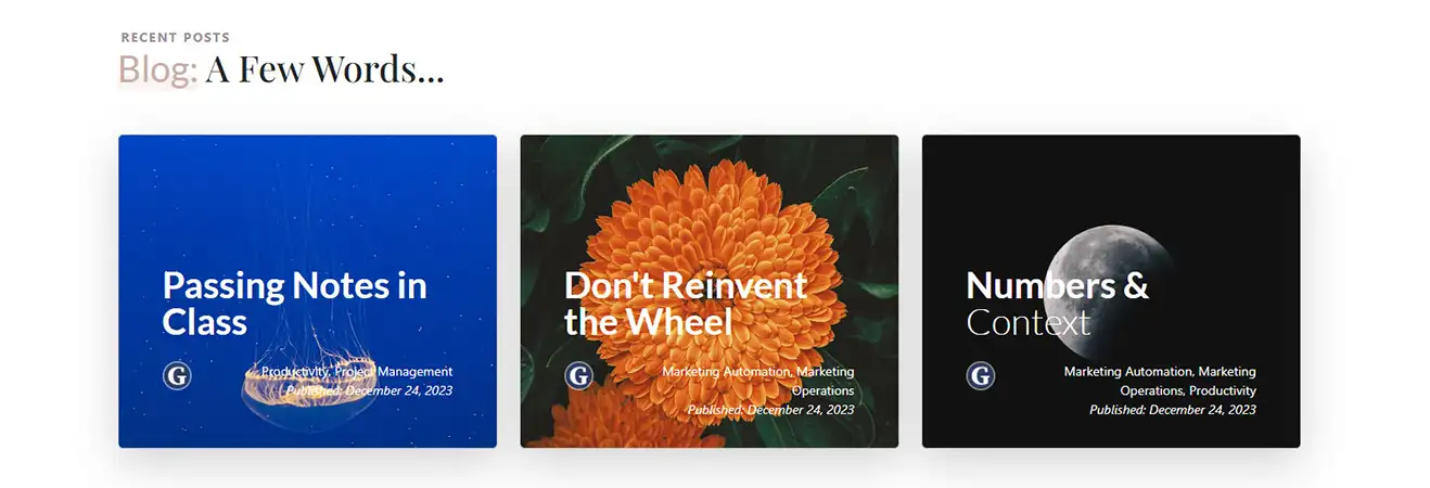
I wanted a lot of visual impact (especially since this element is repeated often on the site in the blog sections), so I decided to go with cards that had image/photo backgrounds early on. Bright Unsplash images, along with some other creative coding bits help put this together.
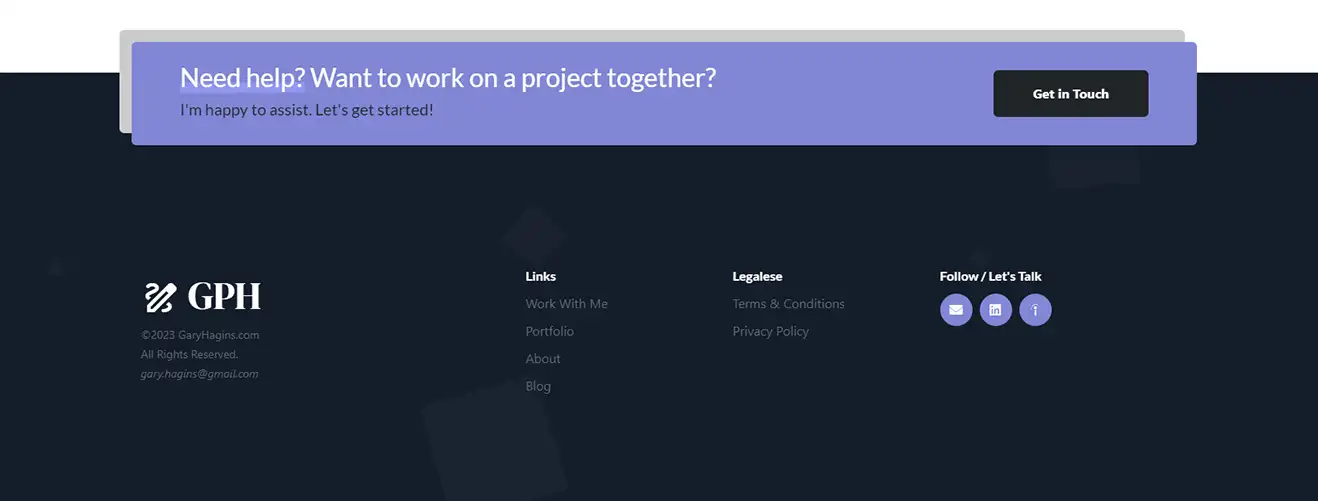
Tying in visually with the site header (and re-using the original squares animation). When possible and appropriate, I prefer a simple footer. And while footers can get even simpler than this, I often like a little structure and functionality to keep the user journey moving, when appropriate. Here, it made sense to include just a little bit extra.
Recent Posts